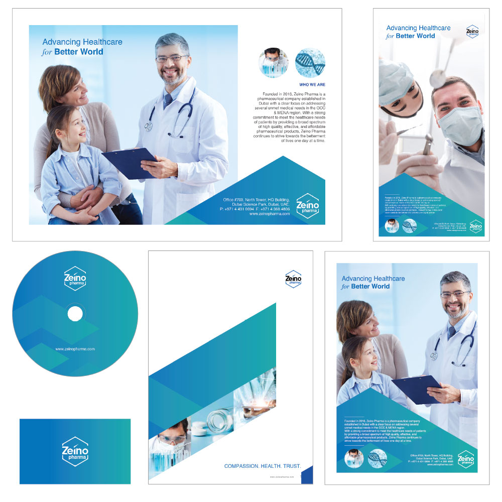
LOGOFOLIO


The logo employs the hexagon, one of the principal governing patterns that is dominant in the natural world - the Building Block of Creation. The hexagon is a symbol of harmony and balance. Zeino has used the color blue in its logo, as blue is associated with health, healing, and tranquility. It symbolizes trust, wisdom, confidence, and intelligence.
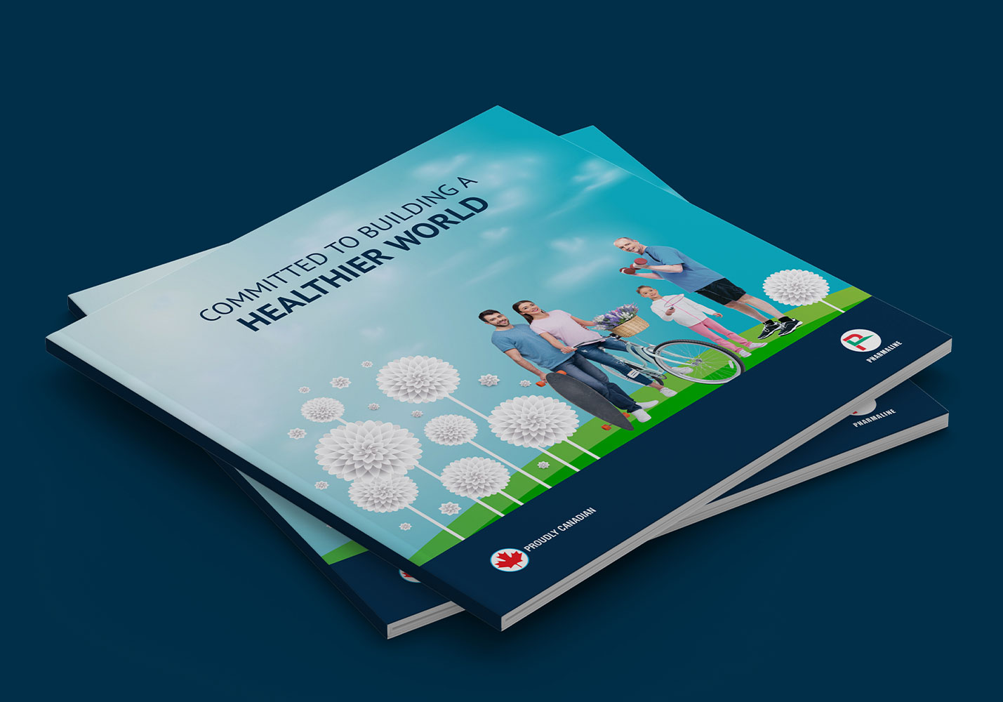
These guidelines have been designed to help you apply the Zeino Pharma visual identity easily and consistently. The identity reflects the purpose and aims of the Zeino Pharma as an efficient pharmaceutical organization. It is designed to produce attractive materials that confirm to the organization’s key corporate communication principles.
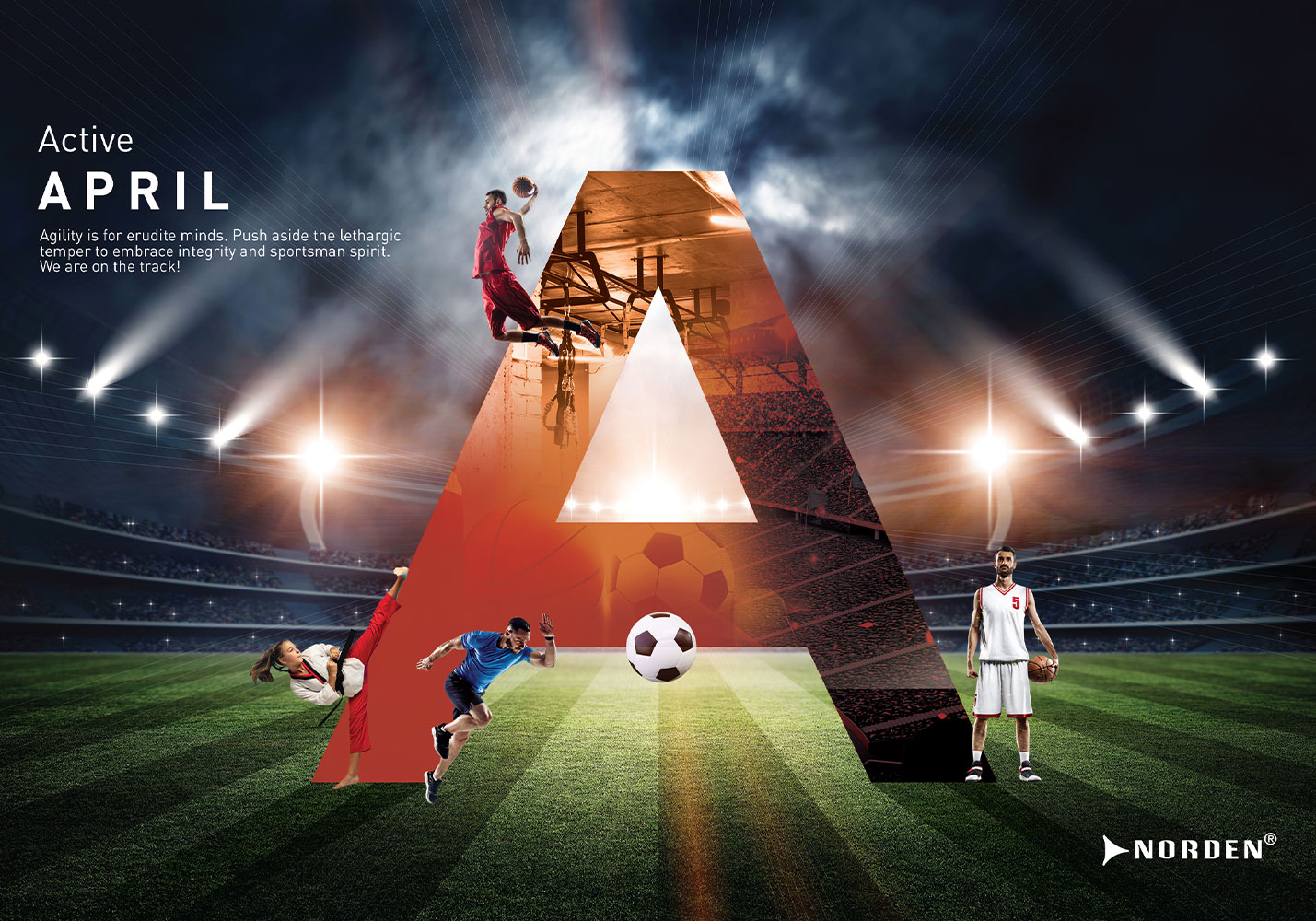
Compliance with this corporate Identity guide, ensures a degree of uniformity in Zeino Pharma’s corporate branding and the way it wishes to communicate internally, and with the outside world. And to this effect Zeino Pharma has recreated and outlined its own corporate brand guideline manual. The manual will provide valuable insights and directions as to how Zeino Pharma should be seen as a corporate brand. A copy of the manual will be made available upon request.Nomad was responsible for developing a new brand identity and communication strategy that will be used to achieve the goals of the airline. Develop creative concepts for Multimedia Channels.
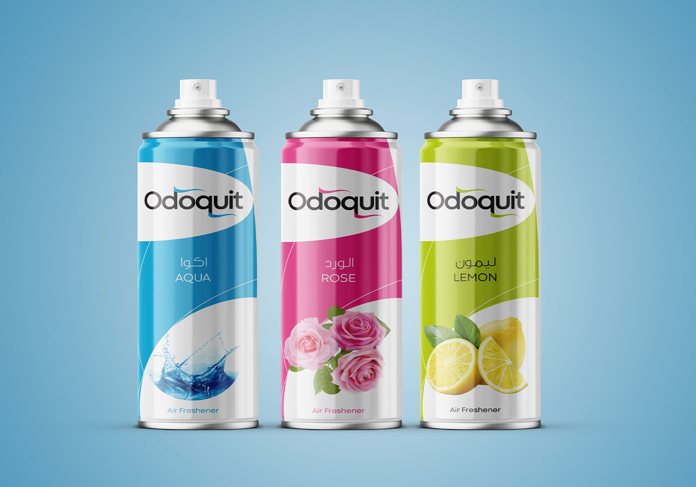
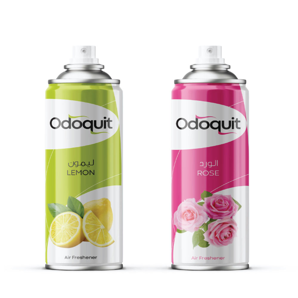
The Al Bahja Group of the Sultanate of Oman dates its prestigious history to 1947. The Al Bahja Group has spread its branches over a very vast sector of fields, not only in Oman but in other Gulf countries as well. The main reason behind the success of the Al Bahja Group is the unbeatable, exemplary leadership given by the most visionary Mr. Karsandas Hamli. Currently, the group has become an emperor with an incomparable reputation in the main sectors of the economy of the Sultanate of Oman, such as agriculture, FMCG, copper, real estate, hotels and resorts, pharmaceuticals, and alternative energy solutions.
Odoquit air fresheners were one of the oldest products of Al Bahja Group, and it was timely to give a new identity to the product. But it was a gigantically challenging task, as it has already well-established its identity among people over the years. But using the latest technological support, we gave a modern design and outlook to the Odoquit air fresheners using aluminum cans.

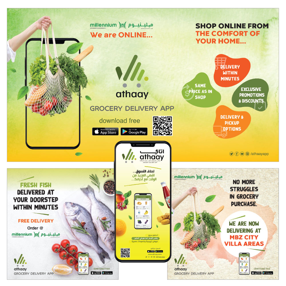
Athaay is a ggocery delivery APP which is having their services in UAE and KERALA.Athaay is a grocery delivery application that is currently functioning in the UAE and Kerala, India. This brand was designed during the lockdown time of the COVID-19 pandemic to make people’s lives easier. The simple yet meaningful logo of Athaay is in the shape of a hand with the index finger pointing forward and of a grocery trolley that is full. This logo implies that, with just one touch, you can easily fill up your grocery cart. And also, the logo is designed with different shades of green, the color of wealth and prosperity, to represent the Arab and Indian communities.